Tuesday, 27 January 2015

Reviewing 2014


It’s a while since I posted on my blog, so here’s a brief review of 2014.

After my Lithography sessions working at Edinburgh Printmakers in January and the preparations for the Lit&Phil exhibition in April, we sailed away to the Outer Hebrides for a short break exploring the islands from Lewis, through Harris, then North and South Uist and down to Eriskay.


My head was filled with memorable colours and textures, wonderful coastlines and skies, always with Kathleen Jamie’s beautiful descriptions of the islands in mind. I also had fun spotting the locations in Peter May’s ‘Lewis Trilogy’!  Mixed weather sent us back to Skye in search of some mountain views - but the weather closed in even more - so no drawing from this trip.


Back in Newcastle, we installed my exhibition, ‘Mountains in Mind’, in the Lit&Phil main reading room - a wonderful space.


It was great to be able to show a lot of my drawings alongside some amazing early mountaineering books from the library’s collection.


The symposium, ‘Mountain Legacies,’ organised by Drs Abbie Garrington (Newcastle University) and Chris Donaldson (Lancaster University) and the opening of the show were well attended.


My presentation, ‘Meditations and Inspirations’, about spending time working in the high mountains was also very well received. To my delight, someone fell in love with my monotype of Island Peak in the Khumbu, having stood on the top of it himself, and took it home with him.


At the end of June I had an exhibition at the lovely Customs House gallery by the Tyne at South Shields. This was part of the International Print Biennale which is organised by Northern Print. My large monotype triptych of Ama Dablam was on show for the second time this year!


Then it was time for our annual trip to the Alps and Dolomites. Unseasonable weather again limited my drawing opportunities, but I did make some work in the Chamonix valley.


Recently a visit to Barter Books in the old Alnwick rail station yielded some inspiring mountain books.
 
In the introduction to his book, ‘Peaks and Valleys’, published in 1938, wonderful photographer, Frank Smythe writes:
‘..there is no more difficult subject for the artist than a mountain, for mountains are essentially static…. They are inimical to life, and the movement is restricted to clouds, streams and the play of the wind, whilst the scale on which they are built is as deceiving to the eye as to the brush. A skilful drawing or painting of hill scenery needs no justification, but the daubs that find their way…even into the Royal Academy…are proof that to any but an artist of exceptional skill and experience, who must perforce devote himself to his subject, hills are better left alone.’
 
 
No pressure then!


Autumn found me back working at Northern Print at last! (More of that later).


 The year began with inspiration from William Tillyer’s amazing watercolours in his exhibition at MIMA. ‘Against Nature’,
and from Ornulf Opdahl’s magnificent Nordic landscapes at University Gallery in Newcastle. It ended with the equally inspiring late Turner watercolours at Tate Britain and the enormous Anselm Kiefer paintings and sculptures at the Royal Academy, topped off by the moving late self portraits by Rembrandt at the National Gallery.


But now I’m off to read some more of Mrs Aubrey Le Blond’s collection of colourful accounts of ‘True Tales of Mountain Adventure’ published in 1903, courtesy of the Lit and Phil. With chapter headings like ‘A Wonderful Feat by Two Ladies - a Perilous Climb’ - the ladies being Miss Anna and Miss Ellen Pigeon of London, in 1869 - how can I resist!


Tuesday, 27 May 2014

Scenes from an Exhibition

The Lit&Phil, Newcastle upon Tyne, 21 May - 11 June 2014

It takes longer than you think to put on an exhibition!

First, there's the planning.....

How to tie your brain in knots trying to visualise the space and how the work will fit into it!


Then there's the framing....
The exhibition is in the main reading room of the beautiful Lit&Phil library, so boards are needed to hang the work.


 Re-painting some.....
 
..... and checking out the hanging system for the others.
Then the time has come to get some order into the chaos, trying out the hanging order to get an idea of how the images will work with each other - bit of a squeeze in the available space in the studio!
Positions decided, so just got to wrap everything up ready to load into the van - and type up lists of work, labels, prepare prints for the browsers, sort out material for the display cases and make information panels. Then unload, carry everything up the lovely stone staircase into the library, install it and label everything. Easy really!!
So why not come along and join Thomas Bewick any time during The Lit&Phil opening hours and see how it all worked out! He seems to be enjoying it - hasn't moved for a week!!
 

Saturday, 5 April 2014

And Finally - Edinburgh, the end of the beginning!

So - eventually - back to my second sojourn in Edinburgh in January. It seems a long time ago now as we rush through April and summertime is officially here - although not in the North East where it seems more like November at the moment!

Tuesday morning and another pleasant train journey along the Northumberland coast delivered me to Waverley Station in time to arrive at Edinburgh Printmakers for the afternoon session.

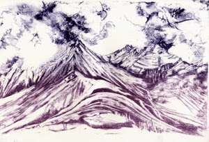
My first job was to create an acetate for a second colour on the Cuillin image.


I transfer this to the clean stone, process it, roll it up with black and leave it to rest overnight. Time flies when you're having fun!


Wednesday morning and another acetate - this one for the second colour on the Ama Dablam image. It's such a good process this - just like making monotypes but with the option to produce more than one print! Again I transfer it to the other clean stone, process it and leave it to rest.


Meanwhile I mix up a colour blend of dark blue and purple ink and use it to roll up and proof the Cullin stone. I'm so pleased with the resulting image, which has a lovely graphic quality, that I decide to print a separate edition of it.


Finally get round to adding this colour layer to the Cuillin image!

A short tea break, then clear the decks and prepare to print the Ama Dablam acetate transfer. 


I mix a deep, purplish blue, proof the stone and print the second colour layer. I like the strong contrast this makes with the first blue - it makes me think of moonlight on the mountain so I carry on and complete the edition.

By now, I'm well into the evening session - it's turned into quite a marathon today - so I call it a day (and a half!) and head off to the chip shop round the corner for my supper.

I start Thursday's session chemically cleaning the Cuillin stone to prepare it for another colour layer. While it's drying I create another acetate, then transfer it to the stone and process it. While it rests, I mix a rusty 'bracken' colour. After a break for coffee I proof the stone and print the third colour layer. I decide to add this to half the edition and retain the rest as a two-colour print.


The time has come to take a proper break so it's off to Broughton Street and The Bakehouse in search of a late lunch before tackling the cleaning up.

Then off to Waverley with a satisfactory hoard of new prints to take back to Northumberland. An enforced break will keep me from EP for a while, but come the spring, I will be back!


Sunday, 23 February 2014

New Year 2014 - at Edinburgh Printmakers

With New Year celebrations out of the way, I headed back to Edinburgh Printmakers again with high hopes of making some new stones using the maniere-noire and acetate transfer techniques I learnt back in December. I planned to spend three days working in the studio this time.

I wanted make some deletions to my Cuillin stone - the first one I made - to lighten some areas, then add some colour layers to the image using acetate transfers. I had an image of Ama Dablam in the Khumbu in mind for a new stone.

After a lovely sunny journey on the train with its views of the magnificent Northumberland coast, I arrived at EP around lunchtime and set to work. The process of grinding the stones meant that I ended up with a second clean stone with my name on it - so that meant I could use my reserve image of the Cadini di Misurina to make a third lithograph - and all in three days! I thought Alastair seemed a bit bemused by my ambition!


I made some deletions on the Cuillin stone, lightening up areas using a pumice stick then processed the stone with two gum etches, rolling it up with black ink to protect the image overnight.


Next I prepared the new stone with black ink ready to make the maniere-noire drawing of Ama Dablam. By now it was 7 30pm and far too late to start drawing. I had forgotten how long it takes to process the stones at each stage!


Day 2 - and time to make the drawing of Ama Dablam. Again I used a razor blade and some white spirit and rag, then processed the stone with two gum etches (see 4 December blog), rolled it up with black ink and left it to rest.


Meanwhile I cleaned off the Cuillin stone and rolled it up with a deep blue ink. After proofing it, I printed a run of 12. The adjusted image is now lighter in places so the colour layers should be more effective.

No time left today for anything else but cleaning up! And then off to meet a friend for an early dinner at L’Escargot Bleu.


Day 3 - time to find out how the new Ama Dablam image works! I mixed up a good bright blue, adding some extender to make it more translucent. Having cleaned off the roll up black from yesterday, I rolled up the stone with blue and proofed it.


A good colour, so I printed a run of 12.


 The rest of the session was taken up with re-grinding the Cuillin and Ama Dablam stones to prepare them for my next visit. - yes, I would need to return the following week to add more layers of colour! In three days of intense concentration, I had only managed to produce editions of two single colour images!

Thursday, 5 December 2013

Learning Lithography: Colour Day 2

Back at EP, early if not bright! The last thing I did yesterday was chemically clean and regrind my stone obliterating my lovely drawing! Wondering how I'm going to add more layers to a drawing that no longer exists.


The answer - Acetate transfers! First I lay a sheet of acetate over one of yesterday's prints, marking the registration points with tape. Then the acetate is taped down to the worktop with sellotape and tape. I roll out some printing ink and apply it to the acetate, completely covering the image.


Now the exciting bit - selectively wiping away the ink to reveal the parts of the image which will be left, and using rags, cotton buds and white spirit to add textures to the remaining ink. It's just like making a monotype! Using a colour related to the print helps me see how it will look when printed up.


The acetate is then laid ink side down on the clean stone - neatly reversing the image for printing - and passed through the press. When peeled away the inky image has been transferred to the stone and is ready for processing.


After taking a proof, I decide to make some additions with tuche crayon to bring out the foreground textures and build up the cloud structure.


I take another proof using the Fabriano paper to check that the image is good enough for the second layer of my litho print!

Looks fine to me!

I chose to roll out a graduated slab of blue printing ink to give a subtle variation in the colour, darker in the sky.


I roll up the stone, register the first of yesterday's prints on the stone and pass it through the press.

Now I have my first two colour stone lithograph - a view of Pumori from Tukla Col in the Khumbu Himalaya.


There is just enough time left to experiment with a third layer of colour. I'd like to bring out the warm colour of the rock in the foreground. Again I need to erase most of today's image and add some more tuche crayon to the drawing.


After processing and proofing, I roll up the stone, register one of today's two colour prints and pass it through the press again.

This gives me my three colour stone lithograph. I decide to keep the rest of the edition as two colours.

Feeling very pleased with the weekend's results. Can't wait to go back and make some more work using these techniques.


Wednesday, 4 December 2013

Learning Lithography: Colour Day 1

Saturday morning and I'm back at Edinburgh Printmakers for the second weekend of my Stone Litho adventure - this time with the emphasis on colour.

Alastair begins by announcing that we won't be using the same techniques as last time - cue slight panic as I have been planning how to approach this weekend on the basis of what I learnt last time!

'Maniere-noire' is today's challenge. First, I mask out the image area with sellotape and masking tape and prime it with thinned black ink. Usually it is then rolled up with process black - a very sticky ink. - to create a solid flat area. 


I choose to leave some of the 'atmospheric' effects achieved in the priming process. After applying a 3 drop etch, I leave the stone to rest for half an hour. It is then ready to draw into.


Any hard abrasive materials can be used for drawing into the ink - blade, pumice stick, sandpaper, wire wool, carborundum. 


I choose to use a razor blade to create lines and softer scraped areas.


After protecting the drawing with rosin and talc, I etch most of it with a fairly strong 11 drop gum mixture. On the more delicate sky area, a 3 drop etch is enough.


After half an hour, the ink is removed with white spirit, leaving a greasy film on the stone. I prime and roll up the stone again with black ink and a second etch is applied to further stabilise the image.


Before printing I clean off the ink again and roll it up with my chosen printing ink - a good deep blue - and put it through the press.


Now I can see the results of my labours today - and I am very pleased with this first stage. The 'maniere-noire' technique suits the way I like to work. It has aspects of both etching, in the line - and monotype, in the process of working into a block of ink.

Tomorrow we'll be adding more layers of colour. An exciting prospect!