So - eventually - back to my second sojourn in Edinburgh in January. It seems a long time ago now as we rush through April and summertime is officially here - although not in the North East where it seems more like November at the moment!
Tuesday morning and another pleasant train journey along the Northumberland coast delivered me to Waverley Station in time to arrive at Edinburgh Printmakers for the afternoon session.
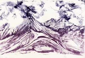
My first job was to create an acetate for a second colour on the Cuillin image.
I transfer this to the clean stone, process it, roll it up with black and leave it to rest overnight. Time flies when you're having fun!
Wednesday morning and another acetate - this one for the second colour on the Ama Dablam image. It's such a good process this - just like making monotypes but with the option to produce more than one print! Again I transfer it to the other clean stone, process it and leave it to rest.
Meanwhile I mix up a colour blend of dark blue and purple ink and use it to roll up and proof the Cullin stone. I'm so pleased with the resulting image, which has a lovely graphic quality, that I decide to print a separate edition of it.
Finally get round to adding this colour layer to the Cuillin image!
A short tea break, then clear the decks and prepare to print the Ama Dablam acetate transfer.
I mix a deep, purplish blue, proof the stone and print the second colour layer. I like the strong contrast this makes with the first blue - it makes me think of moonlight on the mountain so I carry on and complete the edition.
By now, I'm well into the evening session - it's turned into quite a marathon today - so I call it a day (and a half!) and head off to the chip shop round the corner for my supper.
I start Thursday's session chemically cleaning the Cuillin stone to prepare it for another colour layer. While it's drying I create another acetate, then transfer it to the stone and process it. While it rests, I mix a rusty 'bracken' colour. After a break for coffee I proof the stone and print the third colour layer. I decide to add this to half the edition and retain the rest as a two-colour print.
The time has come to take a proper break so it's off to Broughton Street and The Bakehouse in search of a late lunch before tackling the cleaning up.
Then off to Waverley with a satisfactory hoard of new prints to take back to Northumberland. An enforced break will keep me from EP for a while, but come the spring, I will be back!
Saturday, 5 April 2014
Sunday, 23 February 2014
New Year 2014 - at Edinburgh Printmakers
With
New Year celebrations out of the way, I headed back to Edinburgh Printmakers
again with high hopes of making some new stones using the maniere-noire and
acetate transfer techniques I learnt back in December. I planned to spend three
days working in the studio this time.
I wanted make some deletions to my Cuillin stone - the first one I made - to lighten some areas, then add some colour layers to the image using acetate transfers. I had an image of Ama Dablam in the Khumbu in mind for a new stone.
After a lovely sunny journey on the train with its views of the magnificent Northumberland coast, I arrived at EP around lunchtime and set to work. The process of grinding the stones meant that I ended up with a second clean stone with my name on it - so that meant I could use my reserve image of the Cadini di Misurina to make a third lithograph - and all in three days! I thought Alastair seemed a bit bemused by my ambition!

I made some deletions on the Cuillin stone, lightening up areas using a pumice stick then processed the stone with two gum etches, rolling it up with black ink to protect the image overnight.
Next I prepared the new stone with black ink ready to make the maniere-noire drawing of Ama Dablam. By now it was 7 30pm and far too late to start drawing. I had forgotten how long it takes to process the stones at each stage!
Day
2 - and time to make the drawing of Ama Dablam. Again I used a razor blade and
some white spirit and rag, then processed the stone with two gum etches (see 4
December blog), rolled it up with black ink and left it to rest.
Meanwhile
I cleaned off the Cuillin stone and rolled it up with a deep blue ink.
After proofing it, I printed a run of 12. The adjusted image is now lighter in places so the colour layers should be more effective.

Day 3 - time to find out how the new Ama Dablam image works! I mixed up a good bright blue, adding some extender to make it more translucent. Having cleaned off the roll up black from yesterday, I rolled up the stone with blue and proofed it.
A good colour, so I printed a run of 12.
I wanted make some deletions to my Cuillin stone - the first one I made - to lighten some areas, then add some colour layers to the image using acetate transfers. I had an image of Ama Dablam in the Khumbu in mind for a new stone.
After a lovely sunny journey on the train with its views of the magnificent Northumberland coast, I arrived at EP around lunchtime and set to work. The process of grinding the stones meant that I ended up with a second clean stone with my name on it - so that meant I could use my reserve image of the Cadini di Misurina to make a third lithograph - and all in three days! I thought Alastair seemed a bit bemused by my ambition!

I made some deletions on the Cuillin stone, lightening up areas using a pumice stick then processed the stone with two gum etches, rolling it up with black ink to protect the image overnight.
Next I prepared the new stone with black ink ready to make the maniere-noire drawing of Ama Dablam. By now it was 7 30pm and far too late to start drawing. I had forgotten how long it takes to process the stones at each stage!
Day
2 - and time to make the drawing of Ama Dablam. Again I used a razor blade and
some white spirit and rag, then processed the stone with two gum etches (see 4
December blog), rolled it up with black ink and left it to rest.
Meanwhile
I cleaned off the Cuillin stone and rolled it up with a deep blue ink.
After proofing it, I printed a run of 12. The adjusted image is now lighter in places so the colour layers should be more effective.
No
time left today for anything else but cleaning up! And then off to meet a
friend for an early dinner at L’Escargot Bleu.

Day 3 - time to find out how the new Ama Dablam image works! I mixed up a good bright blue, adding some extender to make it more translucent. Having cleaned off the roll up black from yesterday, I rolled up the stone with blue and proofed it.
A good colour, so I printed a run of 12.
The
rest of the session was taken up with re-grinding the Cuillin and Ama Dablam
stones to prepare them for my next visit. - yes, I would need to return the
following week to add more layers of colour! In three days of intense
concentration, I had only managed to produce editions of two single colour images!
Thursday, 5 December 2013
Learning Lithography: Colour Day 2
Back at EP, early if not bright! The last thing I did yesterday was chemically clean and regrind my stone obliterating my lovely drawing! Wondering how I'm going to add more layers to a drawing that no longer exists.
The answer - Acetate transfers! First I lay a sheet of acetate over one of yesterday's prints, marking the registration points with tape. Then the acetate is taped down to the worktop with sellotape and tape. I roll out some printing ink and apply it to the acetate, completely covering the image.
Now the exciting bit - selectively wiping away the ink to reveal the parts of the image which will be left, and using rags, cotton buds and white spirit to add textures to the remaining ink. It's just like making a monotype! Using a colour related to the print helps me see how it will look when printed up.
The acetate is then laid ink side down on the clean stone - neatly reversing the image for printing - and passed through the press. When peeled away the inky image has been transferred to the stone and is ready for processing.
After taking a proof, I decide to make some additions with tuche crayon to bring out the foreground textures and build up the cloud structure.
I take another proof using the Fabriano paper to check that the image is good enough for the second layer of my litho print!
Looks fine to me!
I chose to roll out a graduated slab of blue printing ink to give a subtle variation in the colour, darker in the sky.

I roll up the stone, register the first of yesterday's prints on the stone and pass it through the press.
Now I have my first two colour stone lithograph - a view of Pumori from Tukla Col in the Khumbu Himalaya.
There is just enough time left to experiment with a third layer of colour. I'd like to bring out the warm colour of the rock in the foreground. Again I need to erase most of today's image and add some more tuche crayon to the drawing.
After processing and proofing, I roll up the stone, register one of today's two colour prints and pass it through the press again.
This gives me my three colour stone lithograph. I decide to keep the rest of the edition as two colours.
Feeling very pleased with the weekend's results. Can't wait to go back and make some more work using these techniques.
The answer - Acetate transfers! First I lay a sheet of acetate over one of yesterday's prints, marking the registration points with tape. Then the acetate is taped down to the worktop with sellotape and tape. I roll out some printing ink and apply it to the acetate, completely covering the image.
Now the exciting bit - selectively wiping away the ink to reveal the parts of the image which will be left, and using rags, cotton buds and white spirit to add textures to the remaining ink. It's just like making a monotype! Using a colour related to the print helps me see how it will look when printed up.
The acetate is then laid ink side down on the clean stone - neatly reversing the image for printing - and passed through the press. When peeled away the inky image has been transferred to the stone and is ready for processing.
After taking a proof, I decide to make some additions with tuche crayon to bring out the foreground textures and build up the cloud structure.
I take another proof using the Fabriano paper to check that the image is good enough for the second layer of my litho print!
Looks fine to me!
I chose to roll out a graduated slab of blue printing ink to give a subtle variation in the colour, darker in the sky.

I roll up the stone, register the first of yesterday's prints on the stone and pass it through the press.
Now I have my first two colour stone lithograph - a view of Pumori from Tukla Col in the Khumbu Himalaya.
There is just enough time left to experiment with a third layer of colour. I'd like to bring out the warm colour of the rock in the foreground. Again I need to erase most of today's image and add some more tuche crayon to the drawing.
After processing and proofing, I roll up the stone, register one of today's two colour prints and pass it through the press again.
This gives me my three colour stone lithograph. I decide to keep the rest of the edition as two colours.
Feeling very pleased with the weekend's results. Can't wait to go back and make some more work using these techniques.
Wednesday, 4 December 2013
Learning Lithography: Colour Day 1
Saturday morning and I'm back at Edinburgh Printmakers for the second weekend of my Stone Litho adventure - this time with the emphasis on colour.
Alastair begins by announcing that we won't be using the same techniques as last time - cue slight panic as I have been planning how to approach this weekend on the basis of what I learnt last time!
'Maniere-noire' is today's challenge. First, I mask out the image area with sellotape and masking tape and prime it with thinned black ink. Usually it is then rolled up with process black - a very sticky ink. - to create a solid flat area.
I choose to leave some of the 'atmospheric' effects achieved in the priming process. After applying a 3 drop etch, I leave the stone to rest for half an hour. It is then ready to draw into.
Any hard abrasive materials can be used for drawing into the ink - blade, pumice stick, sandpaper, wire wool, carborundum.
I choose to use a razor blade to create lines and softer scraped areas.
After protecting the drawing with rosin and talc, I etch most of it with a fairly strong 11 drop gum mixture. On the more delicate sky area, a 3 drop etch is enough.

After half an hour, the ink is removed with white spirit, leaving a greasy film on the stone. I prime and roll up the stone again with black ink and a second etch is applied to further stabilise the image.
Before printing I clean off the ink again and roll it up with my chosen printing ink - a good deep blue - and put it through the press.
Now I can see the results of my labours today - and I am very pleased with this first stage. The 'maniere-noire' technique suits the way I like to work. It has aspects of both etching, in the line - and monotype, in the process of working into a block of ink.
Tomorrow we'll be adding more layers of colour. An exciting prospect!
Alastair begins by announcing that we won't be using the same techniques as last time - cue slight panic as I have been planning how to approach this weekend on the basis of what I learnt last time!
'Maniere-noire' is today's challenge. First, I mask out the image area with sellotape and masking tape and prime it with thinned black ink. Usually it is then rolled up with process black - a very sticky ink. - to create a solid flat area.
I choose to leave some of the 'atmospheric' effects achieved in the priming process. After applying a 3 drop etch, I leave the stone to rest for half an hour. It is then ready to draw into.
Any hard abrasive materials can be used for drawing into the ink - blade, pumice stick, sandpaper, wire wool, carborundum.
I choose to use a razor blade to create lines and softer scraped areas.
After protecting the drawing with rosin and talc, I etch most of it with a fairly strong 11 drop gum mixture. On the more delicate sky area, a 3 drop etch is enough.

After half an hour, the ink is removed with white spirit, leaving a greasy film on the stone. I prime and roll up the stone again with black ink and a second etch is applied to further stabilise the image.
Before printing I clean off the ink again and roll it up with my chosen printing ink - a good deep blue - and put it through the press.
Now I can see the results of my labours today - and I am very pleased with this first stage. The 'maniere-noire' technique suits the way I like to work. It has aspects of both etching, in the line - and monotype, in the process of working into a block of ink.
Tomorrow we'll be adding more layers of colour. An exciting prospect!
Wednesday, 27 November 2013
Edinburgh revisited - Day 2 Printing the stone
After a very good night's sleep - it's tiring, all this intense concentration - I'm raring to get this stone printed!
Before starting, I rolled up the stone with roll-up black so that I could see how the washes were looking and make any necessary adjustments to the tone. Areas can be lightened or erased using different strengths of gum arabic and nitric acid. This is called 'etching'. Heavy areas can also be scraped away with a razor blade before etching. Once happy with the image, I cleaned off the black ink and got ready to print.
First job was mixing a nice deep blue, one of the colours which evoke the mountain world for me. Next, rolling out the ink so that it will cover the stone but not clagg up the subtleties of the washes! Aiming for a nice quiet hiss from the roller, rather than a sticky slurp!
Then begins the process of inking up the image. The stone is rolled up with three coats of ink before it is passed through the press for the first time, using newsprint (a cheap, thin paper) for the first proof.
This process is repeated twice, gradually building up the ink on the stone until it gives a good depth of colour on the proof. You can see the transition from pale to more intense colour in the photograph. Three proofs on newsprint and the first proof on Fabriano Rosaspina, bottom right.
It is also possible to adjust the image while on the press. Once satisfied with the proof, it's time to edition the print. This is a detail showing the Aiguille - I adjusted the shape of the tower on top slightly before continuing with the editioning.
Now the stone only needs one roll up for each print. A nice smooth editioning paper - Fabriano Rosaspina - is just the thing for my edition. I'm using both white and the softer colour, ivory to give two different 'feels' to the image.
The final image - this one on white, giving a good impression of the cold light of the snowfields.
Now I'm looking forward to next weekend at Edinburgh Printmakers for the second litho course - this time on using colour - can't wait!
Before starting, I rolled up the stone with roll-up black so that I could see how the washes were looking and make any necessary adjustments to the tone. Areas can be lightened or erased using different strengths of gum arabic and nitric acid. This is called 'etching'. Heavy areas can also be scraped away with a razor blade before etching. Once happy with the image, I cleaned off the black ink and got ready to print.
First job was mixing a nice deep blue, one of the colours which evoke the mountain world for me. Next, rolling out the ink so that it will cover the stone but not clagg up the subtleties of the washes! Aiming for a nice quiet hiss from the roller, rather than a sticky slurp!
Then begins the process of inking up the image. The stone is rolled up with three coats of ink before it is passed through the press for the first time, using newsprint (a cheap, thin paper) for the first proof.
This process is repeated twice, gradually building up the ink on the stone until it gives a good depth of colour on the proof. You can see the transition from pale to more intense colour in the photograph. Three proofs on newsprint and the first proof on Fabriano Rosaspina, bottom right.
It is also possible to adjust the image while on the press. Once satisfied with the proof, it's time to edition the print. This is a detail showing the Aiguille - I adjusted the shape of the tower on top slightly before continuing with the editioning.
Now the stone only needs one roll up for each print. A nice smooth editioning paper - Fabriano Rosaspina - is just the thing for my edition. I'm using both white and the softer colour, ivory to give two different 'feels' to the image.
The final image - this one on white, giving a good impression of the cold light of the snowfields.
Now I'm looking forward to next weekend at Edinburgh Printmakers for the second litho course - this time on using colour - can't wait!
Tuesday, 26 November 2013
Edinburgh revisited - Day 1 Drawing the stone
At the beginning of November I spent another two days working in the studio at Edinburgh Printmakers. I wanted to consolidate what I had learned on the weekend course by drawing a new stone and producing another lithograph - this time working more independently. Alastair was still on hand to offer advice though!
This time I worked on a larger stone (A2) which needed grinding with a levigator and carborundum, a coarse grit, to remove the previous image - another new skill under my belt! It can be quite heavy going at first and quite tricky until you get in the swing of it.
A quick check that the stone surface was completely flat, then it was time to get to work on that inviting surface. Again I used the tuche crayons and washes to make an image of the Aiguille du Midi on the Mont Blanc massif.
The washes took a while to dry, even with the help of a fan heater.
Time for a quick cup of tea, then back to work processing the stone - coating it with gum arabic to preserve the white areas and then removing the tuche. It's quite worrying as you see all your drawing disappearing!
However, the tuche is very greasy and leaves its residue in the stone. Priming it with a little black ink magically restores the drawing as it sticks to the greasy areas and is easily washed away from the areas protected by the gum.
And that was it for the day! Time flies when you're having fun!
Back tomorrow to print it!
This time I worked on a larger stone (A2) which needed grinding with a levigator and carborundum, a coarse grit, to remove the previous image - another new skill under my belt! It can be quite heavy going at first and quite tricky until you get in the swing of it.
A quick check that the stone surface was completely flat, then it was time to get to work on that inviting surface. Again I used the tuche crayons and washes to make an image of the Aiguille du Midi on the Mont Blanc massif.
The washes took a while to dry, even with the help of a fan heater.
However, the tuche is very greasy and leaves its residue in the stone. Priming it with a little black ink magically restores the drawing as it sticks to the greasy areas and is easily washed away from the areas protected by the gum.
And that was it for the day! Time flies when you're having fun!
Back tomorrow to print it!
Wednesday, 30 October 2013
Pastures New!
Spent a brilliant weekend at Edinburgh Printmakers recently, learning Stone Lithography with Alastair Clark. Have always wanted to try this technique as it is supposed to be a very responsive medium - and so it is.
This was the first image from my first drawing on the stone - a view of the Cuillin from Sligachan, Isle of Skye.
Some more work on the stone, including some tuche washes which needed to dry overnight.
Some more drawing and adjusting on Sunday and this was the second state of the image.
I'm off to Edinburgh again next week to spend some time in the studio, adjusting the image again and making a new stone. Can't wait!
The stone in question is limestone - my favourite rock - so it was bound to be 'sympatico' as far as I was concerned!
This was the first image from my first drawing on the stone - a view of the Cuillin from Sligachan, Isle of Skye.
Some more work on the stone, including some tuche washes which needed to dry overnight.
Some more drawing and adjusting on Sunday and this was the second state of the image.
I'm off to Edinburgh again next week to spend some time in the studio, adjusting the image again and making a new stone. Can't wait!
Subscribe to:
Posts (Atom)